

PT
Conceito
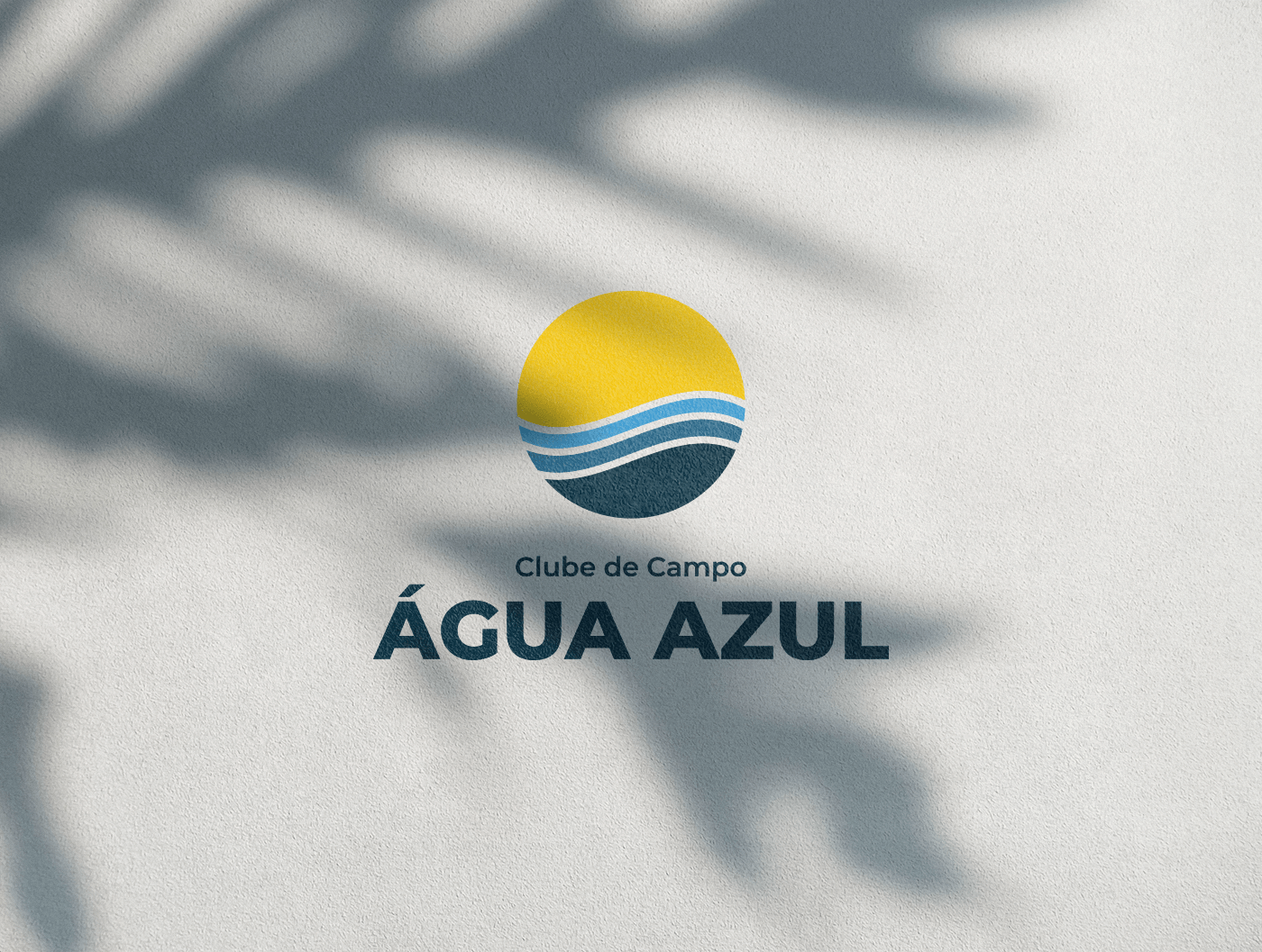
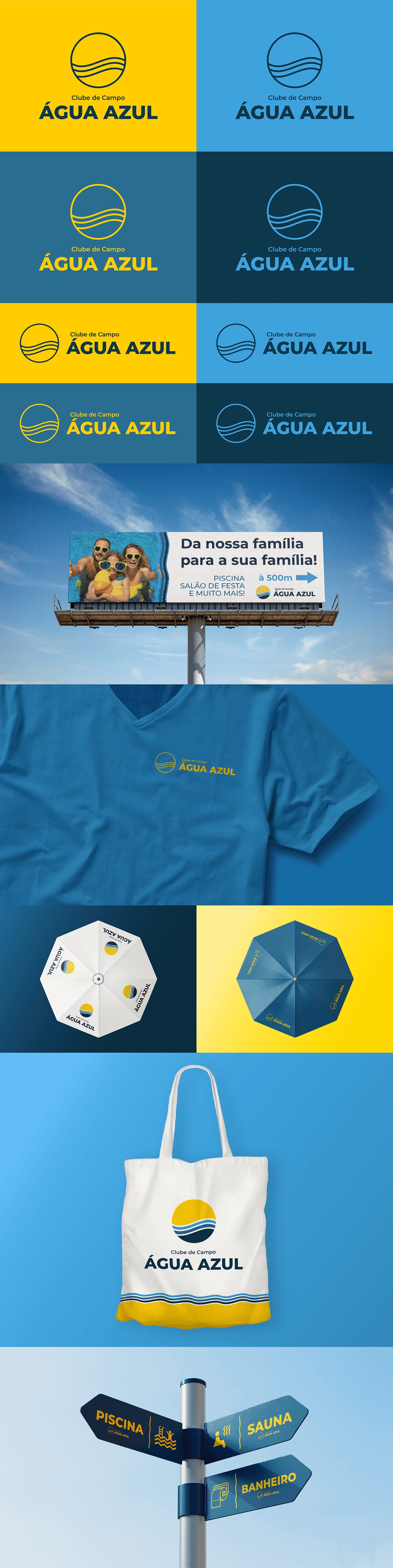
Inaugurada em 1993, o Clube de Campo Água Azul é um espaço de Diversão e Lazer localizado em Apucarana-PR. O local se tornou um dos maiores clubes da Cidade.
Hoje sendo o melhor lugar para o momento de lazer e eventos nos dias mais calorosos.
Hoje sendo o melhor lugar para o momento de lazer e eventos nos dias mais calorosos.
Os atributos da marca são Divertida, Calma e Alegre. Analisando estes atributos, atribuímos ao verão e seus símbolos e características, como o Sol, cuja simbologia é Alegria, e a água, cuja simbologia é a Calma. E foi assim que foi definido o símbolo da marca.
EN
Concept
Opened in 1993, Clube de Campo Água Azul is a fun and leisure space located in Apucarana-PR. The place became one of the biggest clubs in the city.
Today it is the best place for leisure time and events on warmer days.
Today it is the best place for leisure time and events on warmer days.
The brand attributes are Fun, Calm and Joyful. Analyzing these attributes, we attribute summer and its symbols and characteristics, such as the Sun, whose symbolism is Joy, and water, whose symbolism is Calm. And that was how the brand symbol was defined.
Painel Semântico
Moodboard


EN
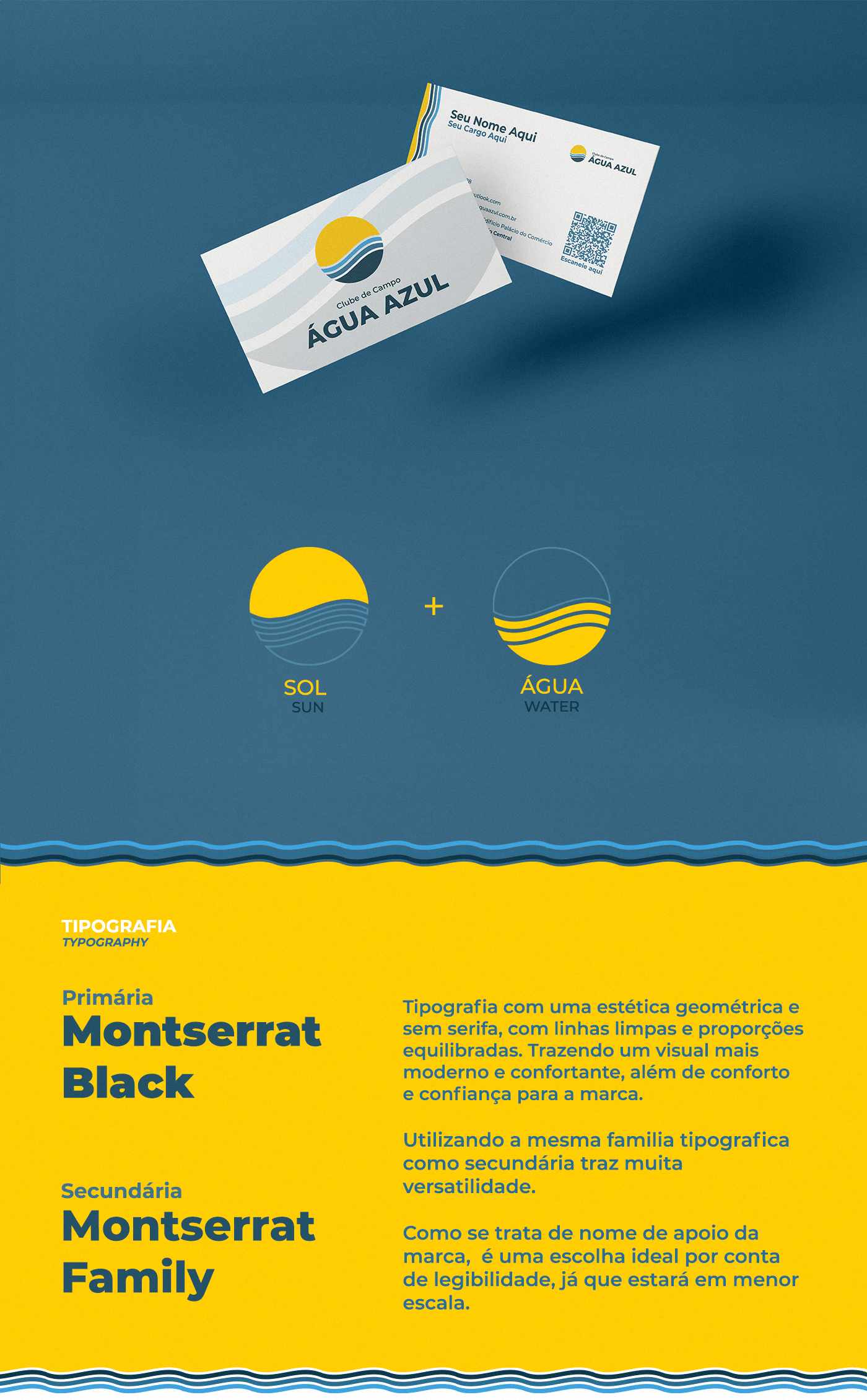
Typography with a geometric, sans serif aesthetic, with clean lines and balanced proportions. Bringing a more modern and comforting look, as well as comfort and confidence for the brand.
Using the same typographic family as secondary brings a lot of versatility.
As it is the brand's supporting name, it is an ideal choice due to readability, as it will be on a smaller scale.

EN
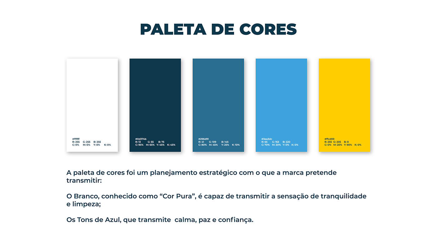
The color palette was a strategic plan with what the brand intends to convey:
White, known as “Pure Color”, is capable of transmitting a feeling of tranquility and cleanliness;
The Shades of Blue, which conveys calm, peace and confidence.

Projeto: Água Azul | Clube de Campo
Desenvolvimento apenas para estudo
Designer: Renan de Oliveira
Março 2024


